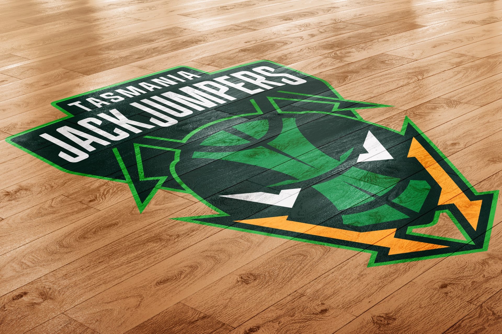
Tasmania JackJumpers: How culture informs iconic brands
Two years ago, we were approached by the National Basketball League and Basketball Tasmania with a dream brief – branding a new Tasmanian NBL organization. Over the past few weeks we’ve watched them defeat Melbourne United and push the dominant Sydney Kings to the limit in the NBL finals. All in their first year in the league. In front of sell out crowds and huge broadcast audiences.
And we couldn’t be prouder of the brand we helped create.
So, how did the JackJumpers brand come about? Like a lot of great creative ideas, it started with a limitation. Due to copyright ownership and competition with other codes, the obvious Tasmanian tropes were off the table. So Devils or Tigers wouldn’t be possible, which opened up other possibilities. What NBL executive Chairman Larry Kestelman made clear is that he wanted to turn heads. Basketball is about entertainment, and playing it safe isn’t entertaining. So cookie cutting a brand wasn’t going to cut it.
So our task was to create something new and fresh that was intrinsically Tasmanian. Our criteria was simple:
- Does it have a strong connection to Tasmania?
- Is it timeless?
- Does it unify the whole state of Tasmania?
- Is it strong, bold and world-class?
- Is there storytelling potential beyond just the name?
- Will the brand inspire a tribal following and behaviours?
After an exhaustive process – guided by a public submission and voting process – we landed on the the JackJumpers. JackJumpers are venomous ants native to Australia. Most frequently found in Tasmania with a potentially lethal sting. They’re wild, fearless, and relentless in battle. Like Tasmania, they’re a little obscure, but once you know the story you’ll never forget it.

The name and concept opened up a design language that could apply to all of the touchpoints that sporting organizations require. The iconic mandibles represent the force and electric energy of the club. Our green and gold state colors connect with the wilderness and the rich sporting pedigree of Tasmania. We created a custom typeface for player uniforms and game day apparel, featuring geometry inspired by ant anatomy. And, of course, a JackJumper can become a memorable mascot. There was a moment there where Jack the Jumper was getting more column inches than the state’s premier.
Like all bold ideas, the name wasn’t universally accepted when it was announced. But we were confident that as the club grew, the name wouldn’t just be accepted, it would be loved. We understood the culture of Australian sport and of Tasmania. We understood the potential for the brand to be truly memorable. And, as an agency founded and led by Tasmanians, we understood that Tasmanians are proudly parochial.
And after a year in the competition, we’re right. Veteran sports journalist Caroline Wilson summed it up on ABC’s Offsiders in the lead-up to the finals. “How did we ever scoff at the name JackJumpers? Isn’t it fantastic?” Wilson said.
“How did we ever scoff at the name JackJumpers? Isn’t it fantastic?”
A year on, we haven’t had control over every aspect of the brand. That can sit uneasily on brand agencies sometimes. But the system we created, and the language that we established has been adopted by the club, the league and the people of Tasmania in ways that we never could have imagined. We didn’t have any Tassie Devil in a JackJumpers jersey tattoos in our brand guide. We didn’t write a punk-rock anthem. But watching a full stadium yelling ‘March! March! March!’ in unison, we knew that we had created a lasting brand that had been wholeheartedly adopted by the community.
And that adoption by the community has tangible commercial outcomes, too. The JackJumpers were back page news nationally. And when it came to the game 3 decider that saw them knock Melbourne United out to make the finals, viewers were up by 105% on the most viewed NBL game in 2021. Reach was up 52%. JackJumpers even trended at #2 nationally on Twitter. Game 3 of the finals series was held in front of a record NBL crowd of over 16000 fans.
And that’s the mark of a truly iconic brand.